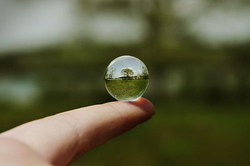
Shapes- formed wherever the ends of a continuous line meet. Geometric shapes such as circles, triangles or squares have perfect, uniform measurements & don't often appear in nature. Organic shapes are associated with things from the natural world, like plants & animals.

Color- wheels show the primary colors, secondary colors, & the tertiary (intermediate) colors. They also show the relationships between complementary colors across from each other, such as blue & orange; & analogous (similar or related) colors next to each other such as yellow, green, & blue. Black & white may be thought of as colors but, in fact, they are not. White light is the presence of all color; black is the absence of reflected light & therefore the absence of color.

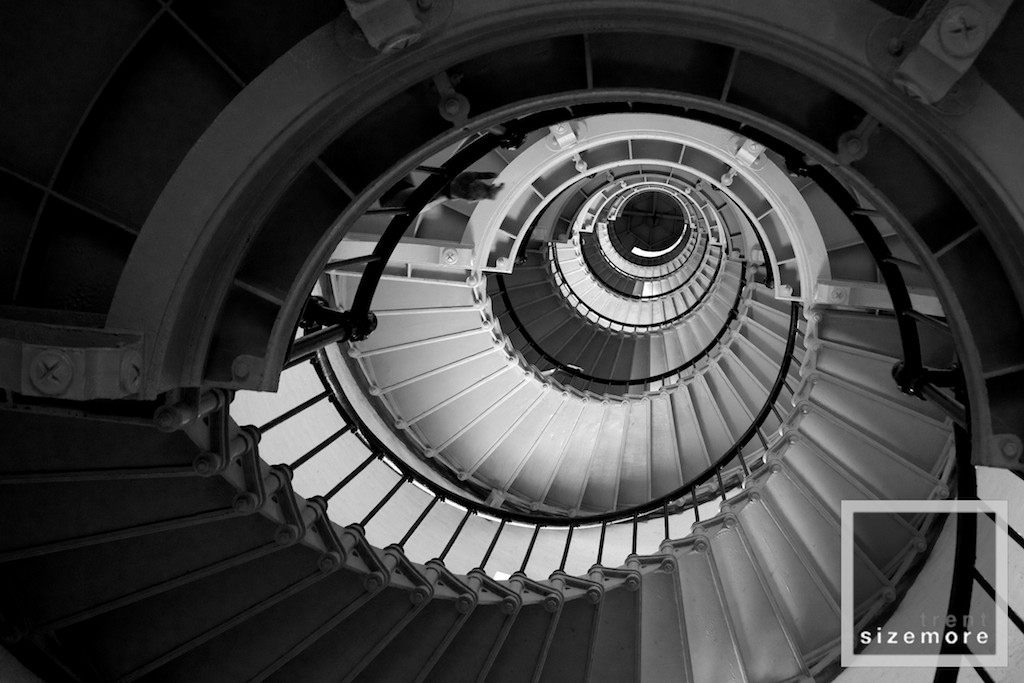
Value- or tone, refers to dark & light; the value scale refers to black & white with all gradations of gray in between. Value contrasts help us to see & understand a two-dimensional work of art.
Form- describes objects that are three-dimensional, having length, width, & height.

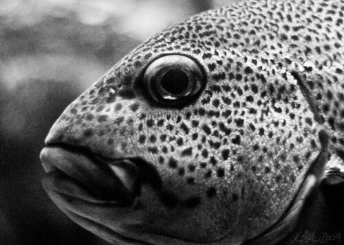
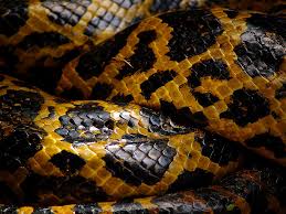
Texture- can be rough, bumpy, slick, scratchy, smooth, silky, soft, prickly--the list is endless. Texture refers to the surface quality, both simulated & actual, of artwork..
Space- refers to distances or areas around, between, or within components of a piece. Space can be positive (white or light) or negative (black or dark), open or closed, shallow or deep, and two-dimensional or three-dimensional.

Balance- is the comfortable or pleasing arrangement of things in art. There are three different types of balance: symmetrical, asymmetrical, & radial. The human figure is symmetrically balanced; the same on the left & right side. The tree is asymmetrically balanced; its branches are not distributed equally on each side, but their total weight is balanced left & right. The sun is an example of radial balance; all its rays are equal in length from the center.
Contrast- is created by using elements that conflict with one another. Often, contrast is created using complementary colors or extremely light & dark values. Contrast creates interest in a piece & often draws the eye to certain areas. It is used to make a painting look interesting.

Emphasis- in the focal area of an artwork gives it importance. An artist may stress some elements of the design over others. The eye of the viewer will focus on the area of emphasis or center of interest first, then take in the rest of the composition.

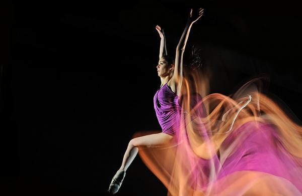
Movement- in an artwork means the artist is taking viewers on a trip through the work by means of lines, edges, shapes, & colors often leading to the focal area. Movement is a visual flow through the composition. It can be the suggestion of motion in a design as you move from object to object by way of placement & position. Directional movement can be created with a value pattern. It is with the placement of dark & light areas that you can move your attention through the format.
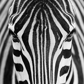
Patterns- are made in art when the same shapes or elements are repeated again and again. Pattern uses the elements of art in planned or random repetitions to enhance surfaces of paintings or sculptures.Rhythm- is the repetition of shapes, lines, and forms.
Rhythm- is a movement in which some elements recurs regularly. Like a dance, it will have a flow of objects that will seem to be like the beat of music.

Unity- all elements in an artwork are in harmony. Unity brings together a composition with similar units. For example, if your composition was using wavy lines & organic shapes you would stay with those types of lines & not put in even one geometric shape.